Cleerly
Graphic Design | Social | UI
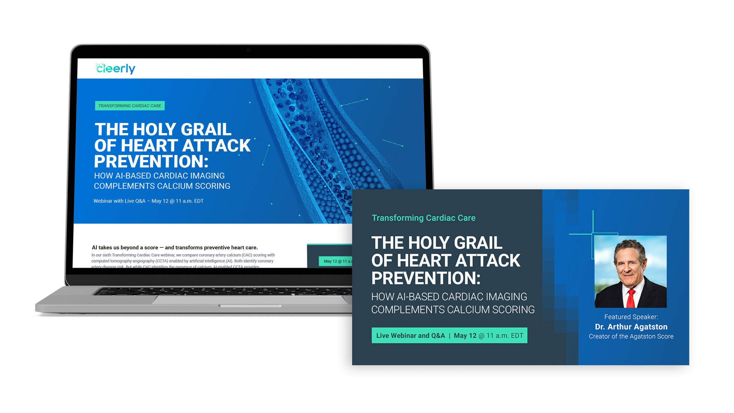
Cleerly uses an AI-based digital care platform to identify and treat heart disease. “Transforming Cardiac Care” is a live webinar series created to promote brand awareness and lead generation. Graphic elements from Cleerly’s existing brand guidelines were leveraged for each event’s graphics.
Hype for the series grew, with the number of registrants steadily increasing over the course of eight webinars, averaging over 300 registrants per event.


A/B Testing
Social images using stock photography were performing below benchmark. After researching best practices, I developed a new layout that included the guest speakers headshot and conducted A/B testing on imagery. Including the headshot in the social image improved click-through rate (CTR) by 50%.
For the following webinars, I continued to test different visual elements: illustration color, headshot size, and font size. Across the board, the new layout with the large speaker headshot performed the best and above benchmark.


